Making ubuntu.com responsive
Retrofitting Canonical's largest web property
I led the responsive retrofitting of ubuntu.com, the largest site that the Canonical web team is responsible for designing and developing.
Ubuntu.com is visited by millions of people every month. The website wasn’t originally designed to be responsive and the web team at Canonical knew it was important to make it easy to access from any device or screen size. The project had the constraints that come with working on legacy code, with limited available time and resources.
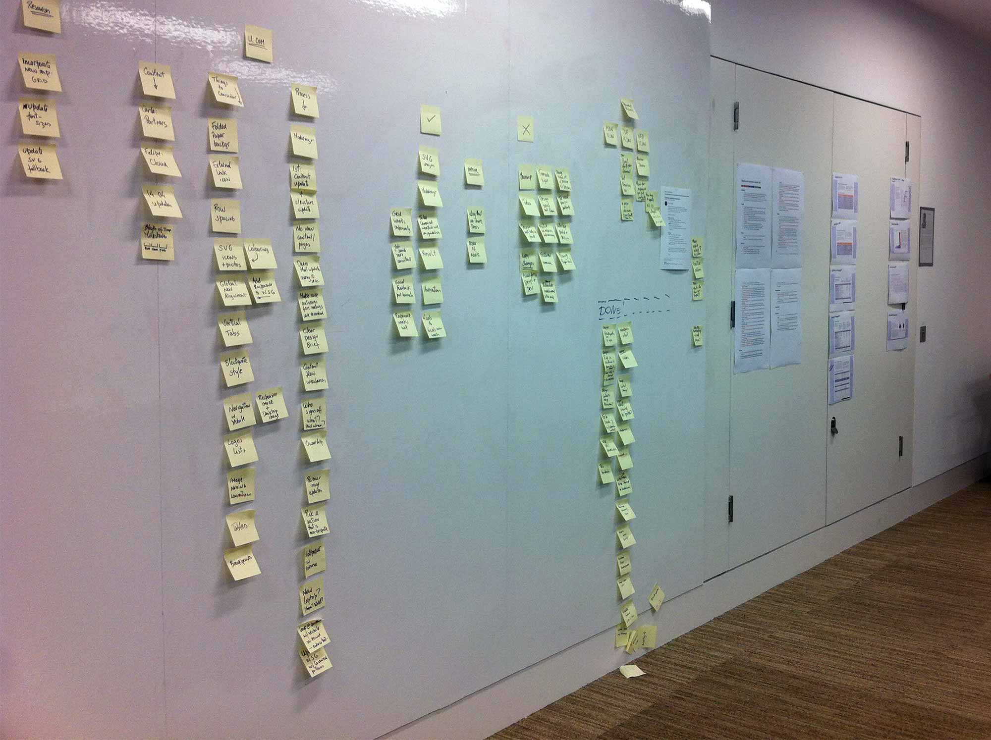
As a first step, I planned the work, dividing it into several stages and smaller projects, tightening and simplifying the scope. This way, the work felt more attainable and the team had regular positive reinforcement through the months when the project ran.
It was also important to make sure that the live site was kept up-to-date and responsive to the needs of the business. The site evolves, grows and is iterated on constantly for releases, upgrades, launches and design updates, so it wasn’t possible to stop everything else and only focus on the retrofit, or to start a new responsive site from scratch.
Quick prototype
Before delving into in depth planning, we created a quick prototype which used the existing CSS but in a mobile-first format. The desktop view of the site followed the existing design, and design rules were defined for smaller screen sizes. This was a simple way to kick-start the project and to picture what ubuntu.com might look like in a responsive world.
Planning
With a quick prototype at hand, it was easier to identify pain points, set realistic goals and expectations, and establish priorities for the project. We deconstructed the project into smaller chunks that were easier to prioritise, dividing the work into different phases in time and identifying the high priority tasks. Most importantly, we defined what would be out of scope from this stage, such as rewriting copy, restructuring the information architecture or updating the site’s visual style.
Smaller projects first
The retrofit of ubuntu.com wasn’t the only project that the web team was working on at this time. Smaller projects were a good testing ground for ideas we had never implemented—it’s easier to test assumptions and new strategies at a smaller scale before they are live on our largest site.
The key projects which informed some of the decisions we later made for ubuntu.com were the redesign of canonical.com and the creation of the new Ubuntu Resources website, both of which I also led.
Some of the key findings from these projects were:
- Improving readability of text for smaller screens couldn’t be achieved by automatically created typographic scales — there was always a certain degree of manual tweaks which involved a lot of real device testing
- Having a solid grid onto which we can confidently place the elements on each screen helped immensely when it came to the speed of development and readability of the content
- The importance of conveying the design intent to developers clearly, across different breakpoints
Content
Updating the structure and content of the website in preparation for making it responsive was not an option, as that would involve a fair number of people and time that were not at our disposal. But we did follow a couple of ‘content rules’:
- Dated content should live in the newly created Ubuntu Insights, a resource centre that holds content like case studies, news and white papers, and which keeps a constant influx of fresh content into ubuntu.com and other Ubuntu sites
- All content should be available in small screens, just as it would in larger screens—no hidden content
Design
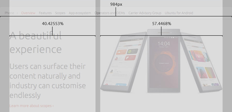
The grid of ubuntu.com was converted to use percentages instead of absolute units ahead of the start of the responsive retrofit, which made it easier to recreate our styles to being fluid.
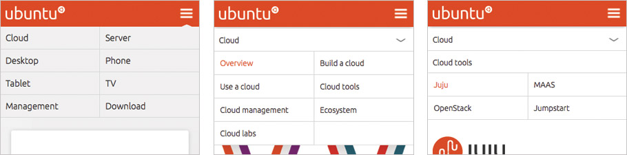
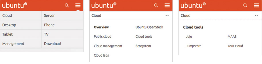
Because of the time and resource constraints, I gathered two visual designers and two UX designers in a room for a couple of hours to brainstorm possible solutions for the site’s navigation. Following existing common design patterns for small screen navigation, we did some paper sketches and a prototype was built following this session so that we could continue to iterate our ideas directly in code. This solution was then tested in our next set of usability sessions, after which we applied only some small tweaks.
To define an approach to responsive images, first we did an image inventory. It was important to understand exactly what type of images were being used, how they were created, who created them, how and where they were added to the site, how the images play with the content and whether there are different levels of importance (UI icons, purely decorative images, infographics, editorial images, etc.). Only after doing this inventory we had sufficient information to decide what to do next. All of our images fell into one of two categories: pictograms, illustrations and logos; and photography and backgrounds. For the first group, we started using SVG and focused on reducing file size for the second group.
Speaking and writing
In 2016, I published a book about moving fixed-width sites to responsive, “Moving to Responsive Web Design”, by Apress, which was largely informed by my work on this project.
I’ve also had the pleasure of speaking about this project at conferences around the world:
- Awwwards Conference in Amsterdam, Netherlands
- View Source Conference in Portland, Oregon
- makingWeb Conference in Oslo, Norway
- Generate Conference in London, UK
- Front Trends in Warsaw, Poland
- Responsive Day Out in Brighton, UK
And I’ve published a series of blog posts on the Ubuntu Design blog as we were working on the project